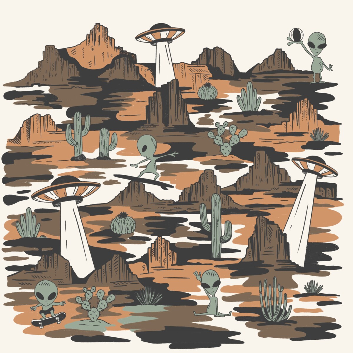
ES No Fear of the Unknown es una ilustración creada para la marca adolescente Other, donde el misterio del universo se encuentra con el humor y la exploración visual. Inspirada en el imaginario de los ovnis, los extraterrestres y los paisajes desérticos, la composición invita a sumergirse en un escenario lleno de pequeños relatos. Cada [...]
Packaging & Campaign | Limited Edition
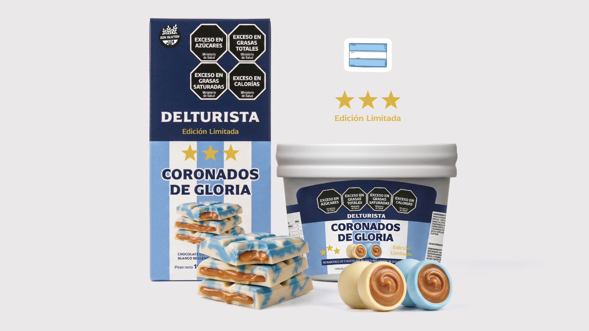
Caro Dast2026-06-15T18:07:49+00:00ES Un gran producto necesita una narrativa visual que no solo destaque en la góndola, sino que conecte con las decisiones de su audiencia. Para este proyecto, el desafío no fue estético; fue estratégico. Buscábamos ir más allá de lo visualmente atractivo. El mercado está lleno de tendencias pasajeras; el cliente necesitaba una identidad [...]
Bassagoda | Branding
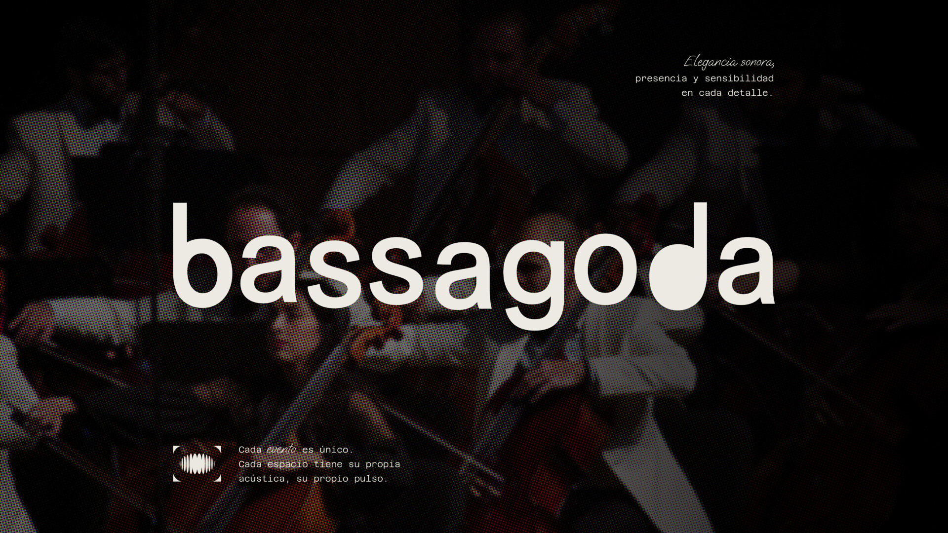
Caro Dast2026-06-13T20:09:14+00:00ES Bassagoda Música conecta artistas, espacios y experiencias a través de una curaduría musical sensible y estratégica. Con una mirada experta sobre el sonido, selecciona y diseña propuestas donde la música se integra de forma natural a cada evento, transformando la atmósfera y generando momentos memorables. Porque cuando la música encuentra su lugar, el espacio [...]

Amoblate | Branding
Caro Dast2026-06-13T20:11:25+00:00ES Amoblate necesitaba una identidad de marca que transmitiera diseño, calidez y profesionalismo en cada punto de contacto. Desarrollamos un sistema visual minimalista y contemporáneo, en el que la silueta de una casa se integra al logotipo, simbolizando estructura, diseño de interiores y una ejecución cuidada hasta el último detalle. Una paleta de colores neutra [...]
MPR | Visual Identity
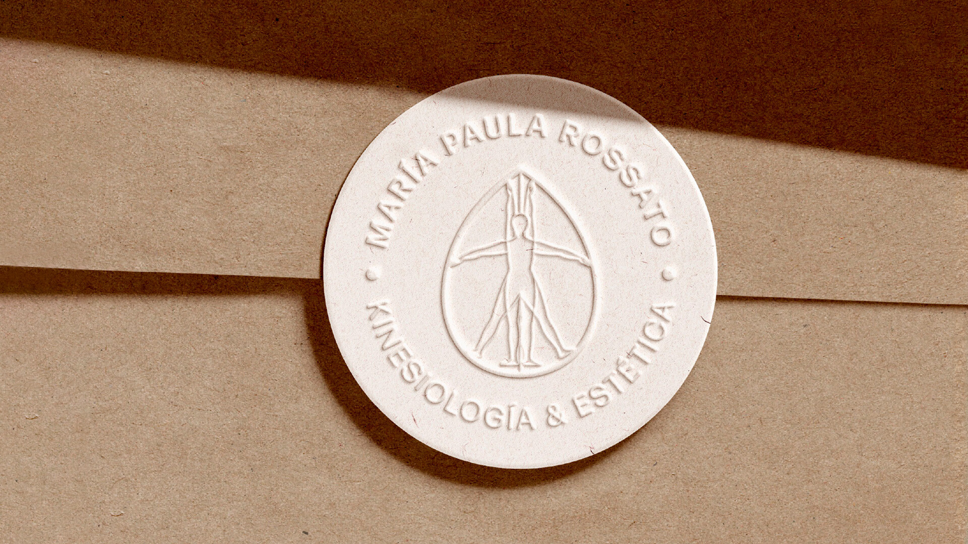
Caro Dast2026-06-13T20:13:03+00:00ES Desarrollamos la identidad visual de la Licenciada en Kinesiología María Paula Rossato, especializada en estética dermatofuncional, con el objetivo de construir una marca que integrara de manera armónica la ciencia, el bienestar y la sensibilidad estética. El principal desafío fue alejarnos del lenguaje visual tradicional del ámbito médico —a menudo frío y rígido— para [...]
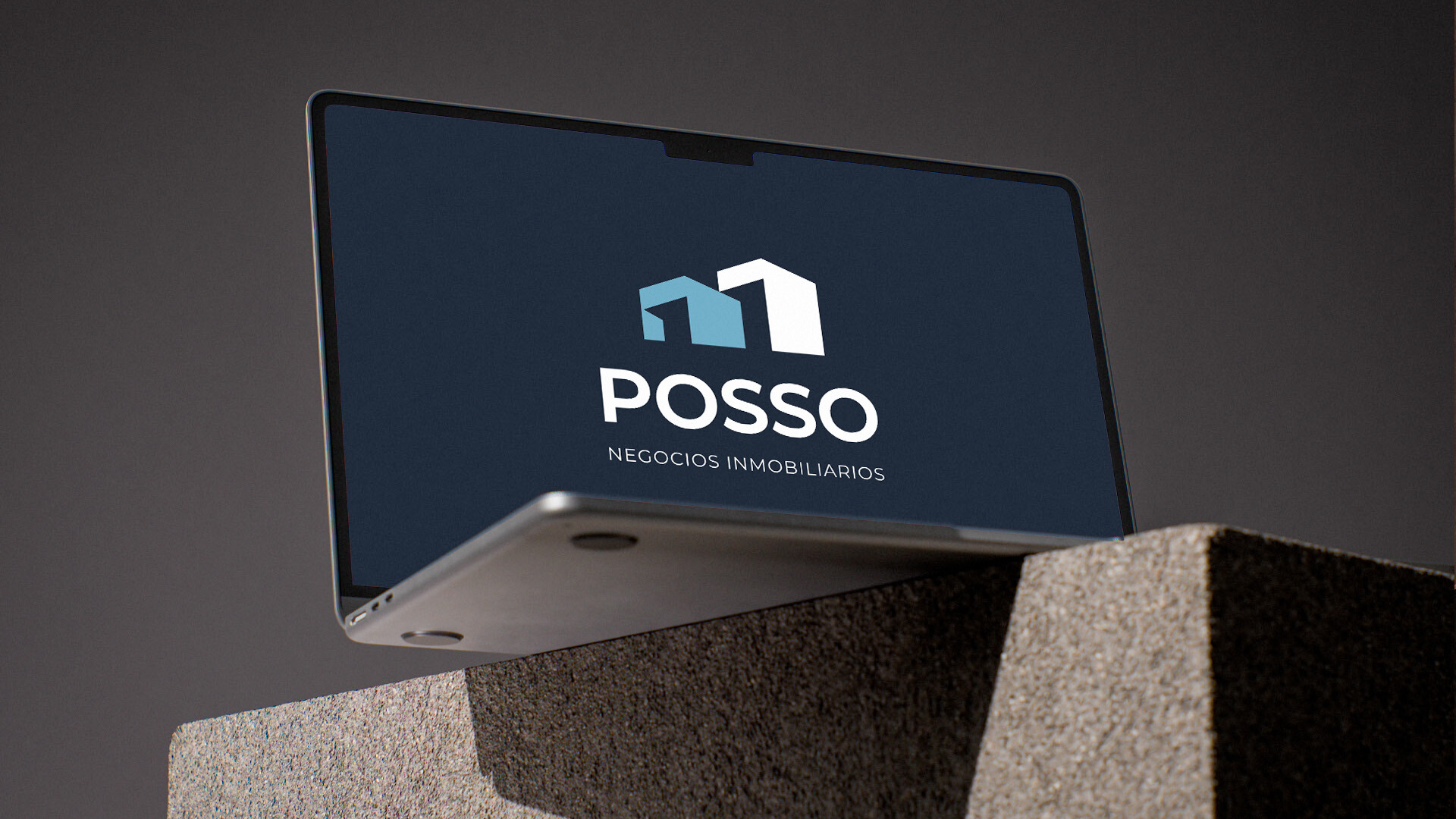
Posso | Branding
Caro Dast2026-06-13T20:14:57+00:00ESPOSSO es una empresa inmobiliaria construida sobre una visión de largo plazo y relaciones significativas. El objetivo no era simplemente diseñar un logotipo, sino desarrollar un sistema de marca capaz de transmitir confianza, solidez y claridad estratégica dentro de un mercado altamente competitivo. La identidad fue concebida como una estructura sólida y contemporánea a la [...]

Udana Cosmetology Branding
Caro Dast2026-06-13T20:16:30+00:00ESDesarrollo de identidad visual para Udana, marca de cosmetología y centro de formación profesional creado por Betiana Weiss. El proyecto incluyó el diseño del logotipo y sus versiones secundarias, la creación del manual de marca, la definición de la paleta cromática y el sistema tipográfico, así como el desarrollo de piezas gráficas impresas y digitales, [...]
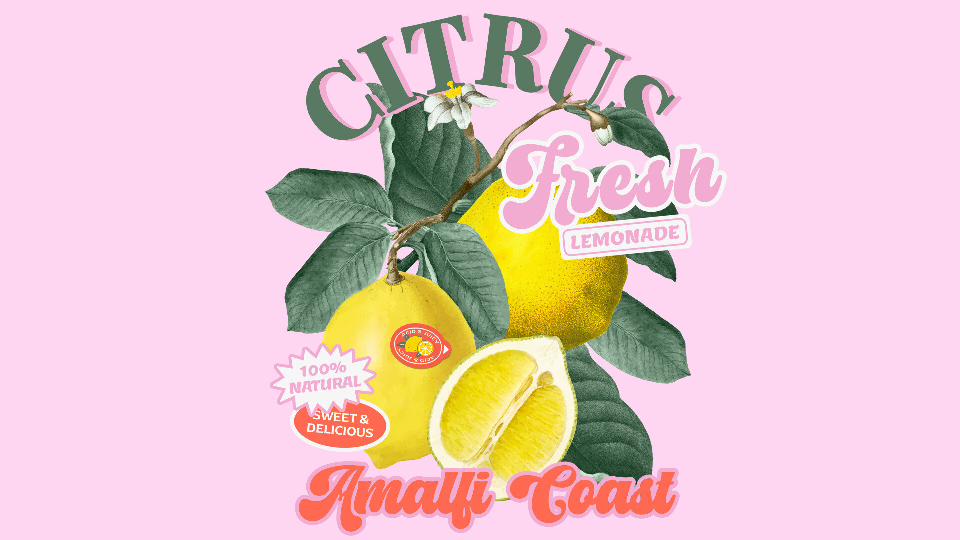
Other | Vintage illustrations
Caro Dast2026-06-13T20:17:49+00:00ESThese illustrations were an exciting creative challenge! I designed this series of vintage-style fruit graphics for the teen brand Other, blending bold colors with rich, detailed textures. A vibrant and playful collection that brings a fresh twist to a classic aesthetic.ENThese illustrations were an exciting creative challenge! I designed this series of vintage-style fruit graphics [...]
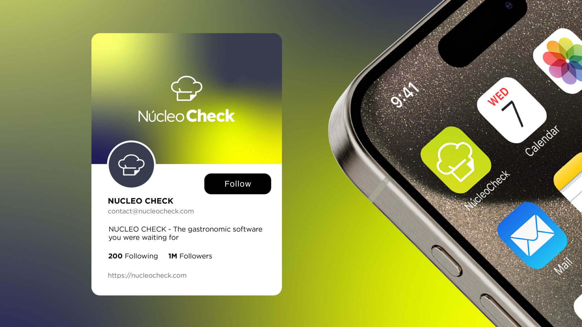
Núcleo Check | Visual Identity
Caro Dast2026-06-13T20:19:30+00:00ESSe desarrolló el diseño del logotipo y sus diferentes versiones, junto con las tarjetas personales y un folleto díptico, concebidos para presentar y promocionar Núcleo Check, un nuevo software de gestión para el sector gastronómico.El sistema visual fue diseñado para comunicar innovación, claridad y profesionalismo, acompañando el lanzamiento de la marca con una identidad sólida [...]
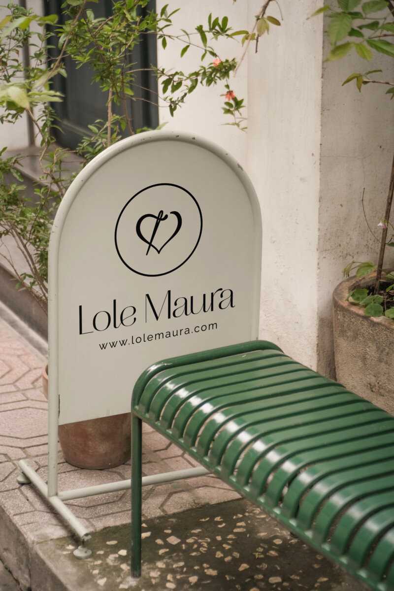
Lole Maura | Branding
Caro Dast2026-06-13T20:22:00+00:00ESLole Maura es una marca de indumentaria consciente, donde cada prenda es confeccionada artesanalmente con especial dedicación. Sus cápsulas de ropa están diseñadas para combinarse entre sí, promoviendo un consumo más consciente bajo el concepto: “Menos cosas, más significado”. Para conocer más sobre este proyecto, hacé clic aquí.ENLole Maura is a conscious clothing brand where [...]